Website Navigation: Best Practices & SEO Value

Website Navigation on Desktop

Users of your site can browse your site effectively without a navigation tool, but they won’t get very far. Designing a solid site navigation tool helps generate more leads, conversions, and improve search rankings. Reorganizing the menu structure is often a time-consuming task, but it significantly enhances user experience and can improve your organic search rankings.

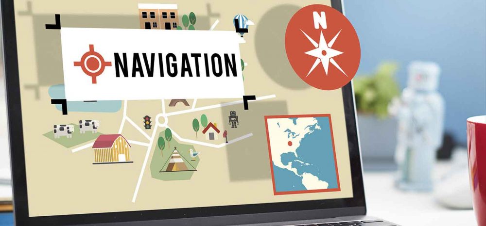
What Does Navigation Do?

“Navigation” of a website is best understood as the means for users to explore your site. When designing your site, ensuring that people can easily move around should be a top priority. If you design a sleek website without an easy way to explore it, what’s the point?

A site’s navigation should highlight your branding, communicate your company’s values, but most of all, guide users along the yellow-brick road of the buying process. High-level pages typically provide basic information for buyers in the awareness stage. But from there, users travel farther to the land of Oz (or checkout), and the longer they spend on this journey, they’ll consume more pages and more detailed information. Effectively, the navigation tool serves as the path to a better user experience, higher lead generation and increased conversion rates.

SEO Considerations

Improving search rankings can be a valuable byproduct of a solid navigation tool, but there are a couple of things to consider:

  • – Google’s crawlers can read and understand the navigation
  • – The anchor text of the link matches important keywords
  • – Ensure important SEO pages are prominent
  • – Do not distract the user with too much information and avoid spammy language
  • – Available and digestible on mobile devices


Giving priority to important pages is the easiest, most strategic and effective way to organize your navigation structure. An organized hierarchy allows search engine crawlers to understand the weight each page carries. Moreover, it makes the navigation easier for the user, which Google prioritizes above anything else. If you keep in mind these five considerations, and the potential impact they’ll have, your navigation will strengthen page authority and overall search rankings.

Need a tool for understanding if Google’s robot can crawl your navigation? Use the Fetch as Google tool.

Great Examples of Fun Designs

Now that we have an idea of what navigation does, and the ways it can add value. Let’s take a look at a few sites with creative design.
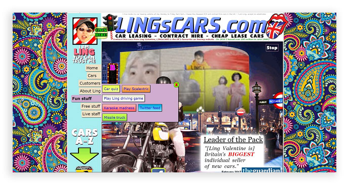
Road Runner Sports

Drop down menus can be an effective navigation tool even though some advise against it. Take Road Runner Sports, for example:

Road Runner Sports Drop Down Menu

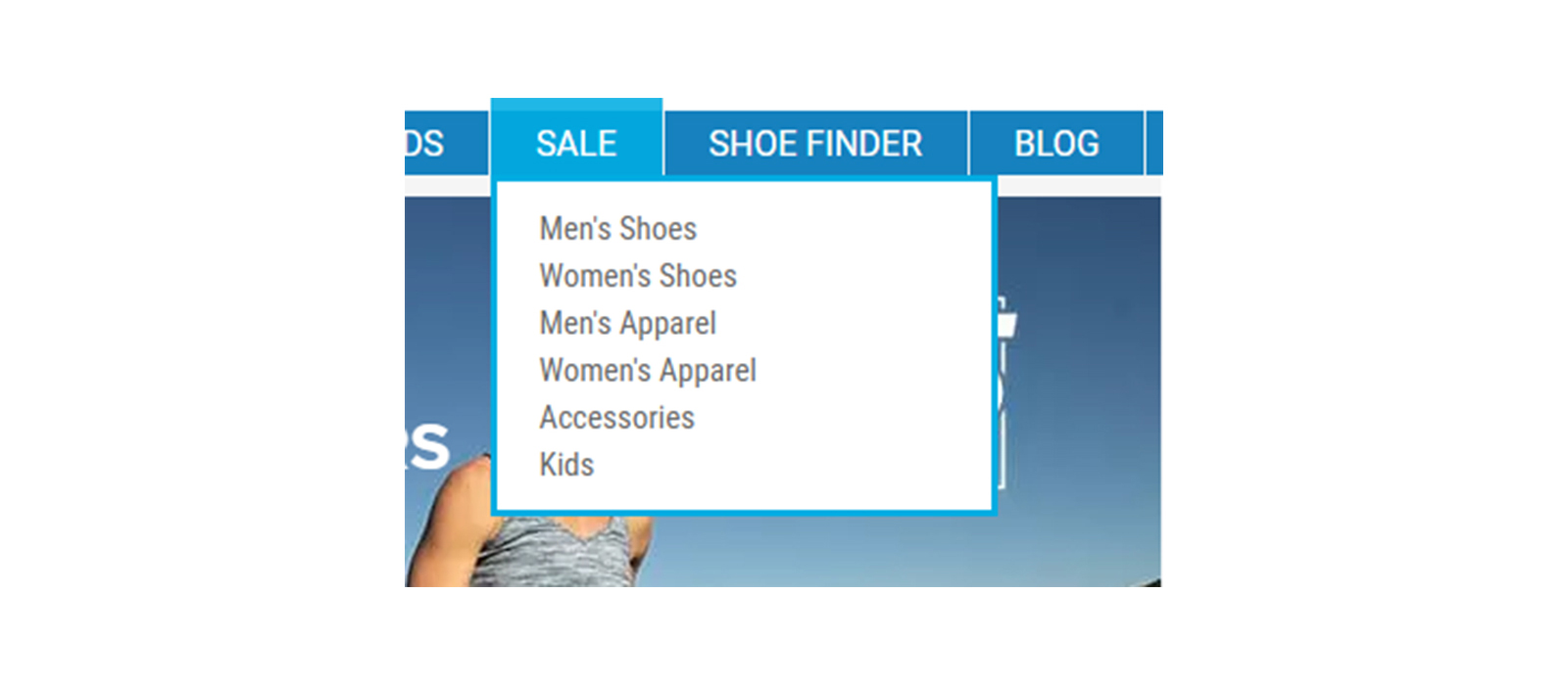
A drop down menu is a great way to add multiple pages in a navigation without feeling spammy. That way, anyone shopping for deals can easily find it on the homepage rather than clicking “men’s shoes,” and then “sale.” It guides visitors down the sales funnel in a more efficient way.

The most important consideration with a larger dropdown is that Googlebot can crawl it. If you are using JavaScript or another non-HTML code base, be sure that all pages are crawled. A great way to see how Googlebot is digesting a site is by looking at your server’s log files. If you see the bot hitting your homepage and then the pages in your navigation, chances are that everything is all set!

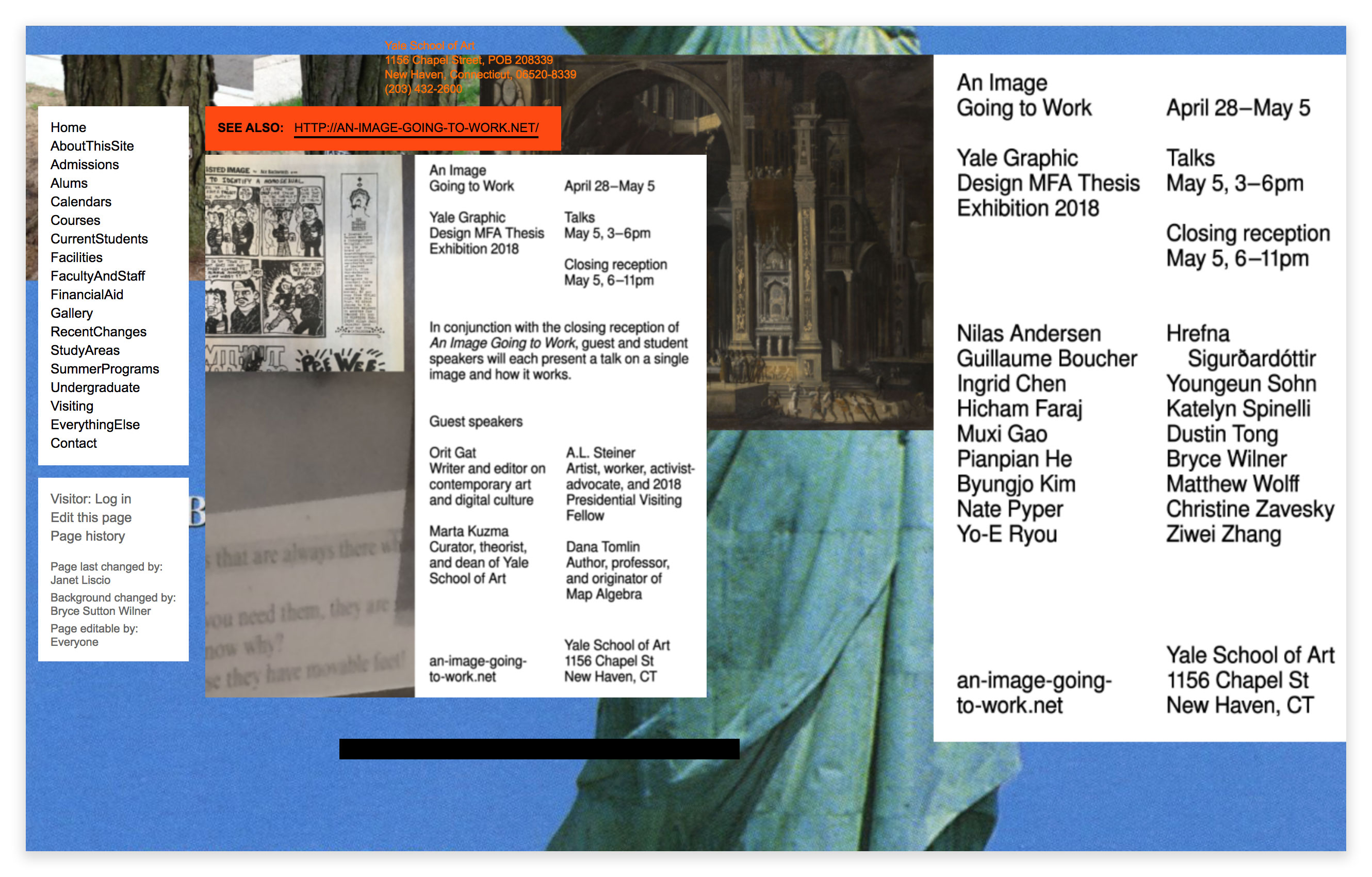
TransUnion SmartMove

Chicago based consumer credit check agency TransUnion keeps its design simple, but effective for anyone to navigate with its tenant screening tool, SmartMove.

TransUnion-SmartMove

See how they provide the most important pages in the header? But they go the extra mile with their display by giving users a more immersive, interactive tool below, as well. Also notice how the logo is in the top left. Some companies forget to do this even though it should be obvious — the logo should always link to the homepage.
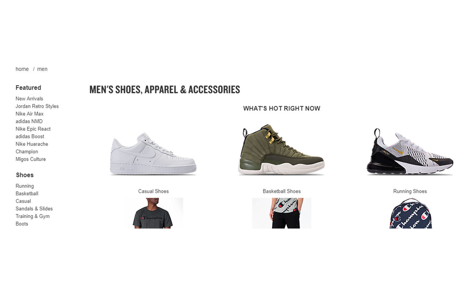
Finish Line

This retail shoe store gives us the perfect window into site navigation that gently leads to lead generation and conversions. On the men’s shoes page, we see a right-rail navigation that provides more detailed information for consumers. Remember, the deeper down the sales funnel the user goes, the more detailed pages become. This allows visitors (and the search engine crawlers) to find exactly what they’re looking for.

Finish-Line-Men's-Shoes

Tying It All Together

Think of your site navigation as the express train of your site. There will be different stops along the way, but the final destination is a conversion. If you keep your site simple, fun and effective, it increases the chances of users reaching that destination. By leveraging the built-in SEO considerations, the overall value can’t be debated.

For more information on website navigation techniques, click here.

Web Design Scholarship 2019

Web Design Devices

Web Design Scholarship Summary

2018 is the second year Websauce Studio is offering the Web Design Scholarship. The purpose is to see how the next generation views the shift to a mobile first world and how web designers will need to adapt their design and user experience to smaller screens and different expectations from users.

A 250-word minimum essay is required outlining how web design must adapt to a mobile world, an example of a website that works well on mobile, and an explanation of why it’s a good mobile experience.

Scholarship Award: One student will be awarded $500

Award Date: December 31, 2018

Enrollment: Open to students enrolled in an undergraduate program by December 11, 2018, at any accredited U.S. college or university.

Application:

  1. Applicant’s name, address, phone number
  2. College or university of attendance in December 2018
  3. Degree being pursued
  4. A 250-word minimum essay of how web design must adapt to a mobile world. Provide an example of a website that works well on mobile and why it’s a good mobile experience.
  5. There are no other requirements including GPA requirements

Where to Apply: Email your application attached as a word document to scholarship@websaucestudio.com.

How will the winner be chosen?

Each essay will be read by our Creative Director, Adam Weil, and Marketing Director Andrew Peluso. The winner will be chosen based on how well thought through the reasoning provided for your arguments are. Your logic may be based on data, culture, anecdotal evidence, or any other means of reasoning you see fit.

Application Submission Deadline: December 11, 2018

Our Address:

Websauce Studio
2100 K St #1
Sacramento, CA 95817

See our web design portfolio for inspiration.

Avoid These 8 Bad Web Design Mistakes

Web Design Bad Practices

Whatever constitutes good web design is a very subjective matter. Some people think that for a website to have good web design, it must have an incredibly sleek and modern look. Others want the web design to be as simple as possible as long as it’s functional and serves their business’ purpose.

Regardless of the business owner’s preferences, there are certain things about web design that web designers should know better than to incorporate into their work.

1. Bad navigation

Navigating a site should always be easy for the user. Messy navigation is bound to frustrate anyone who visits your website, and leaving it for another site—your competitor most likely—is not going to be a problem.  If you organize the navigation bar and sitemaps better, your visitors will not get lost while exploring your site, and they will stay on your page a little longer.

bad navigation web design

2. Cluttered design

This becomes a more common scenario when SEO is a part of website design. Because Google’s number two ranking factor is content, the philosophy of some is, “The more content, the better!” However, when this takes away from the user experience you may lose visitors which could result in losing leads and customers.

Don’t be afraid to use white space. This makes it easier for visitors to scan your website and find the information they’re looking for.

website cluttered web design

3. Splash pages

Splash pages aren’t all bad, but the cons usually far outweigh the pros. If someone has come to your site, it’s to access your content. A splash page interrupts them from doing so and causes friction which will inevitably result in some users bouncing. Not only are you providing a poorer user experience, but an increase in bounce rate can hurt your SEO.

One use case where a splash page may be helpful is when you’re doing a website launch countdown. In this case, the splash page provides the user with useful information. You may also be able to collect their email if they wish to be notified the day the site launches.  

splash page website

4. Auto-playing music

The World Wide Web Consortium (W3C) is the main international standards organization for the World Wide Web and notes, “…we discourage the practice of automatically starting sounds (especially if they last more than 3 seconds), and encourage that the sound be started by an action initiated by the user after they reach the page, rather than requiring that the sound be stopped by an action of the user after they land on the page.”

If you’ve ever navigated to a website where sound automatically played, then you know what a surprise it is and how annoying it can be.

Why do you think Facebook videos have the sound turned off as the default setting? With around one third of the world on their platform, they probably have a pretty good understanding of what makes a good user experience, and clearly automatically playing sound is not one of them.

5. Ad overload

Ads are alright, but when they’re crowding the site you’re designing, they become downright irritating, especially when they’re of the pop-up variety. Keep in mind ad overload depends on your audience and context.

The chart above by Ezoic shows that sitewide on the website they ran the test against, users started bouncing significantly more after six ads. The article goes on to show that if the traffic comes from organic search then users would bounce significantly more after just two ads.

website ads study

6. Tiny fonts

There was a time when fonts as small as 12 px were essentially the standard for websites. With the evolution of screens turning to smaller mobile devices this consideration becomes even more important. Size 16 font seems to provide the best reading experience.

web design mobile font size

7. Too much color

Web designers have a lot of color choices today, so you can’t blame them if they decide to play with them in their work. The problem is, some of them go to town on the colors they use and end up with a garish-looking website. Ideally, a website should have two to three colors, maximum. Anything more than that and the page you’re working on would be splattered with color combinations from hell.

web design too much color

8. Zero Mobile-Friendliness

Attention has shifted to mobile devices and years into this shift users expect mobile-friendly sites. Not catering to the mobile crowd is not a good idea because a site with zero-mobile friendliness means you won’t get any business from the hordes of smartphone and tablet users out there.

Web designers today should make the websites they work on easily viewable on mobile devices. And if their clients don’t want their sites to have mobile versions, they should at least remind them gently of a little thing called Mobile-First Index, which Google rolled out in March of 2018.

mobile friendly web design

We may differ in our ideas of good or bad web design, but the poor designs mistakes listed above will, in most cases, lead you down a path of much better design and improve your users’ experience.

Sacramento State Web Design Scholarship

Sacramento State University Web Design Scholarship

At Websauce Studio we believe in giving back to our community. So far, we’ve done this by volunteering with a local non-profit, Campaign One At A Time, and speaking about web design theory with students in a classroom setting at Sierra College.

We’re excited to announce that we will be expanding our community involvement with a scholarship exclusively to students attending Sacramento State University and pursuing a career in web design or web development.

college student writing essay

Scholarship Award: One student attending Sacramento State University will be awarded $200

Award Date: December 31, 2017

Enrollment: Open to high school seniors and or students enrolled in an undergraduate program by December 11, 2017 at Sacramento State University and pursuing a career in web design or web development.

Application: Must submit an essay of 250 words or more including:

  1. Applicant’s name, address, phone number, and degree being pursued.
  2. An essay of how web design must adapt to a mobile world. Provide an example of a website that works well on mobile and why it’s a good mobile experience.


Where to Apply: Email scholarship@websaucestudio.com. Submit your application via direct message on our Facebook page. Or mail your submission to us.

How will the winner be chosen?
Each essay will be read by our Creative Director, Adam Weil, and yours truly, Andrew Peluso, Marketing Director. The winner will be chosen based on how well thought through the reasoning provided for your arguments are. Your logic may be based on data, culture, anecdotal evidence, or any other means of reasoning you see fit.

Application Submission Deadline: December 11, 2017

Our Address:

Websauce Studio
2100 K St #1
Sacramento, CA 95817

Web Design Scholarship

iphone 7 dark

2017 is the first year Websauce Studio is offering the Web Design Scholarship. The purpose is to see how the next generation views the shift to a mobile first world and how web designers will need to adapt their design and user experience to smaller screens and different expectations from users.

A 250-word minimum essay is required outlining how web design must adapt to a mobile world, an example of a website that works well on mobile, and an explanation of why it’s a good mobile experience.

college student writing essay

Scholarship Award: One student will be awarded $300

Award Date: December 31, 2017

Enrollment: Open to students enrolled in an undergraduate program by December 11, 2017, at any accredited U.S. college or university.

Application:

  1. Applicant’s name, address, phone number
  2. College or university of attendance in December 2017
  3. Degree being pursued
  4. A 250-word minimum essay of how web design must adapt to a mobile world. Provide an example of a website that works well on mobile and why it’s a good mobile experience.
  5. There are no other requirements including GPA requirements


Where to Apply: Email your application attached as a word document to scholarship@websaucestudio.com. Submit your application via direct message on our Facebook page. Or mail your submission to us.

How will the winner be chosen?
Each essay will be read by our Creative Director, Adam Weil, and yours truly, Andrew Peluso, Marketing Director. The winner will be chosen based on how well thought through the reasoning provided for your arguments are. Your logic may be based on data, culture, anecdotal evidence, or any other means of reasoning you see fit.

Application Submission Deadline: December 11, 2017

Our Address:

Websauce Studio
2100 K St #1
Sacramento, CA 95817