
Whatever constitutes good web design is a very subjective matter. Some people think that for a website to have good web design, it must have an incredibly sleek and modern look. Others want the web design to be as simple as possible as long as it’s functional and serves their business’ purpose.
Regardless of the business owner’s preferences, there are certain things about web design that web designers should know better than to incorporate into their work.
1. Bad navigation
Navigating a site should always be easy for the user. Messy navigation is bound to frustrate anyone who visits your website, and leaving it for another site—your competitor most likely—is not going to be a problem. If you organize the navigation bar and sitemaps better, your visitors will not get lost while exploring your site, and they will stay on your page a little longer.
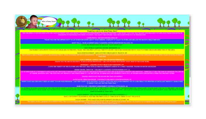
2. Cluttered design
This becomes a more common scenario when SEO is a part of website design. Because Google’s number two ranking factor is content, the philosophy of some is, “The more content, the better!” However, when this takes away from the user experience you may lose visitors which could result in losing leads and customers.
Don’t be afraid to use white space. This makes it easier for visitors to scan your website and find the information they’re looking for.
3. Splash pages
Splash pages aren’t all bad, but the cons usually far outweigh the pros. If someone has come to your site, it’s to access your content. A splash page interrupts them from doing so and causes friction which will inevitably result in some users bouncing. Not only are you providing a poorer user experience, but an increase in bounce rate can hurt your SEO.
One use case where a splash page may be helpful is when you’re doing a website launch countdown. In this case, the splash page provides the user with useful information. You may also be able to collect their email if they wish to be notified the day the site launches.

4. Auto-playing music
The World Wide Web Consortium (W3C) is the main international standards organization for the World Wide Web and notes, “…we discourage the practice of automatically starting sounds (especially if they last more than 3 seconds), and encourage that the sound be started by an action initiated by the user after they reach the page, rather than requiring that the sound be stopped by an action of the user after they land on the page.”
If you’ve ever navigated to a website where sound automatically played, then you know what a surprise it is and how annoying it can be.
Why do you think Facebook videos have the sound turned off as the default setting? With around one third of the world on their platform, they probably have a pretty good understanding of what makes a good user experience, and clearly automatically playing sound is not one of them.
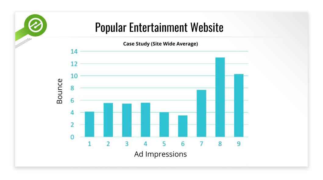
5. Ad overload
Ads are alright, but when they’re crowding the site you’re designing, they become downright irritating, especially when they’re of the pop-up variety. Keep in mind ad overload depends on your audience and context.
The chart above by Ezoic shows that sitewide on the website they ran the test against, users started bouncing significantly more after six ads. The article goes on to show that if the traffic comes from organic search then users would bounce significantly more after just two ads.
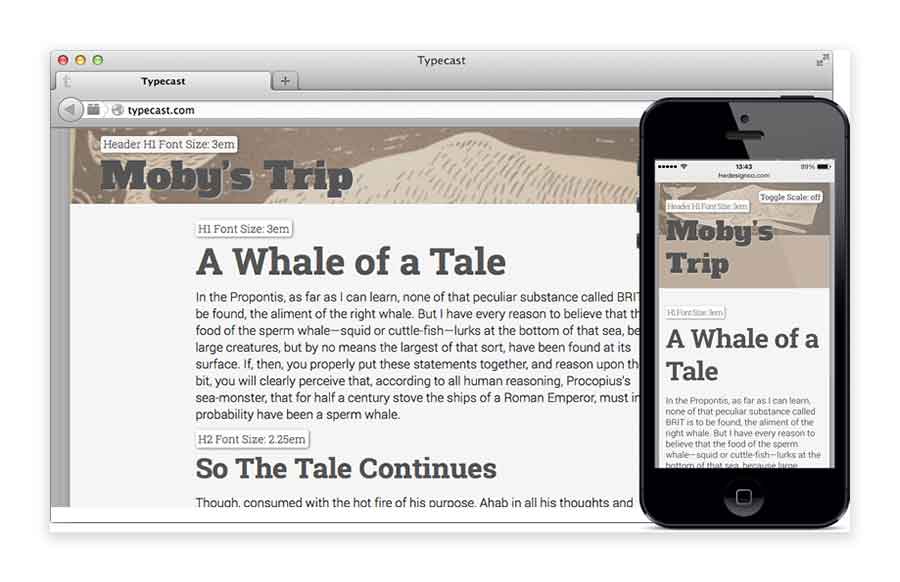
6. Tiny fonts
There was a time when fonts as small as 12 px were essentially the standard for websites. With the evolution of screens turning to smaller mobile devices this consideration becomes even more important. Size 16 font seems to provide the best reading experience.
7. Too much color
Web designers have a lot of color choices today, so you can’t blame them if they decide to play with them in their work. The problem is, some of them go to town on the colors they use and end up with a garish-looking website. Ideally, a website should have two to three colors, maximum. Anything more than that and the page you’re working on would be splattered with color combinations from hell.
8. Zero Mobile-Friendliness
Attention has shifted to mobile devices and years into this shift users expect mobile-friendly sites. Not catering to the mobile crowd is not a good idea because a site with zero-mobile friendliness means you won’t get any business from the hordes of smartphone and tablet users out there.
Web designers today should make the websites they work on easily viewable on mobile devices. And if their clients don’t want their sites to have mobile versions, they should at least remind them gently of a little thing called Mobile-First Index, which Google rolled out in March of 2018.

We may differ in our ideas of good or bad web design, but the poor designs mistakes listed above will, in most cases, lead you down a path of much better design and improve your users’ experience.